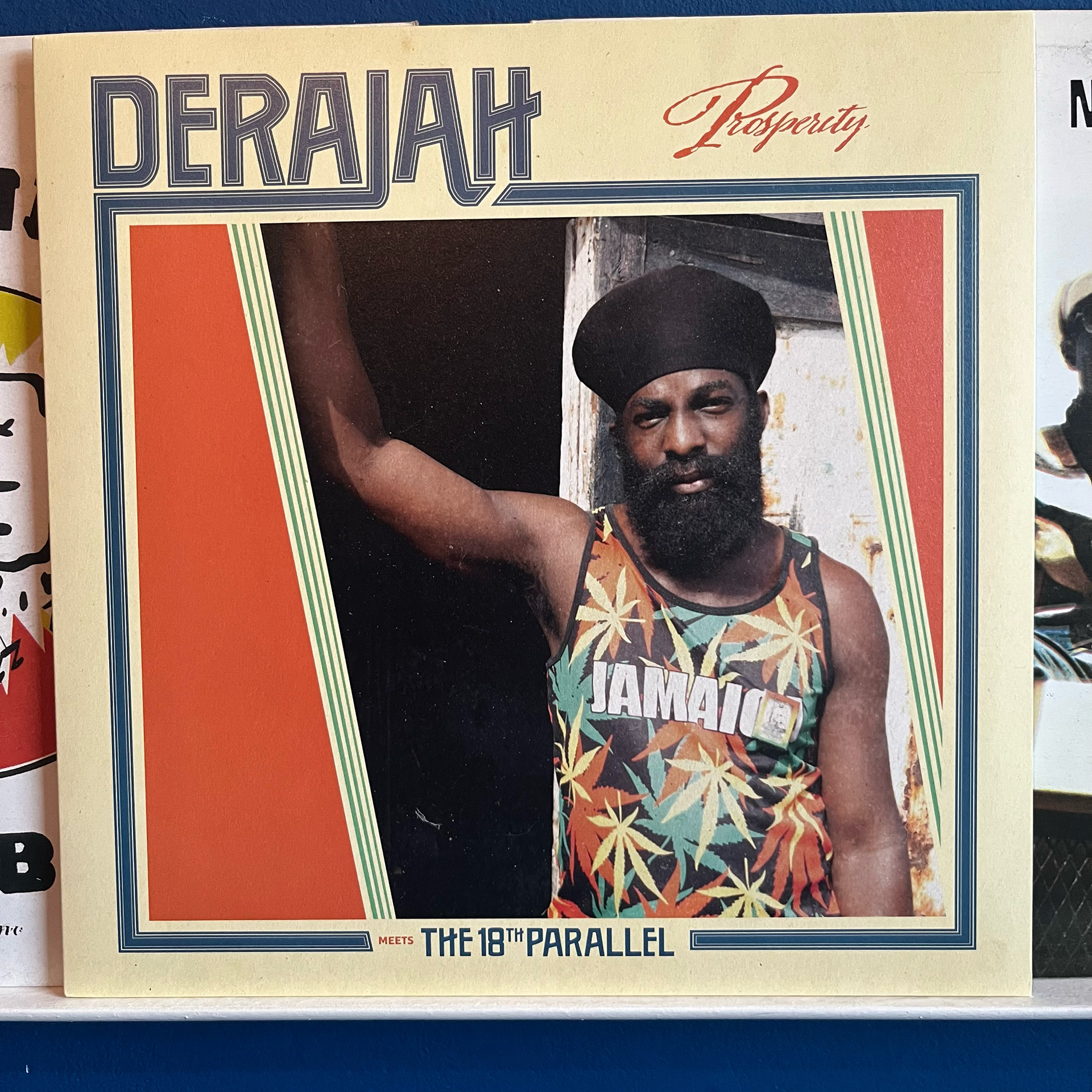
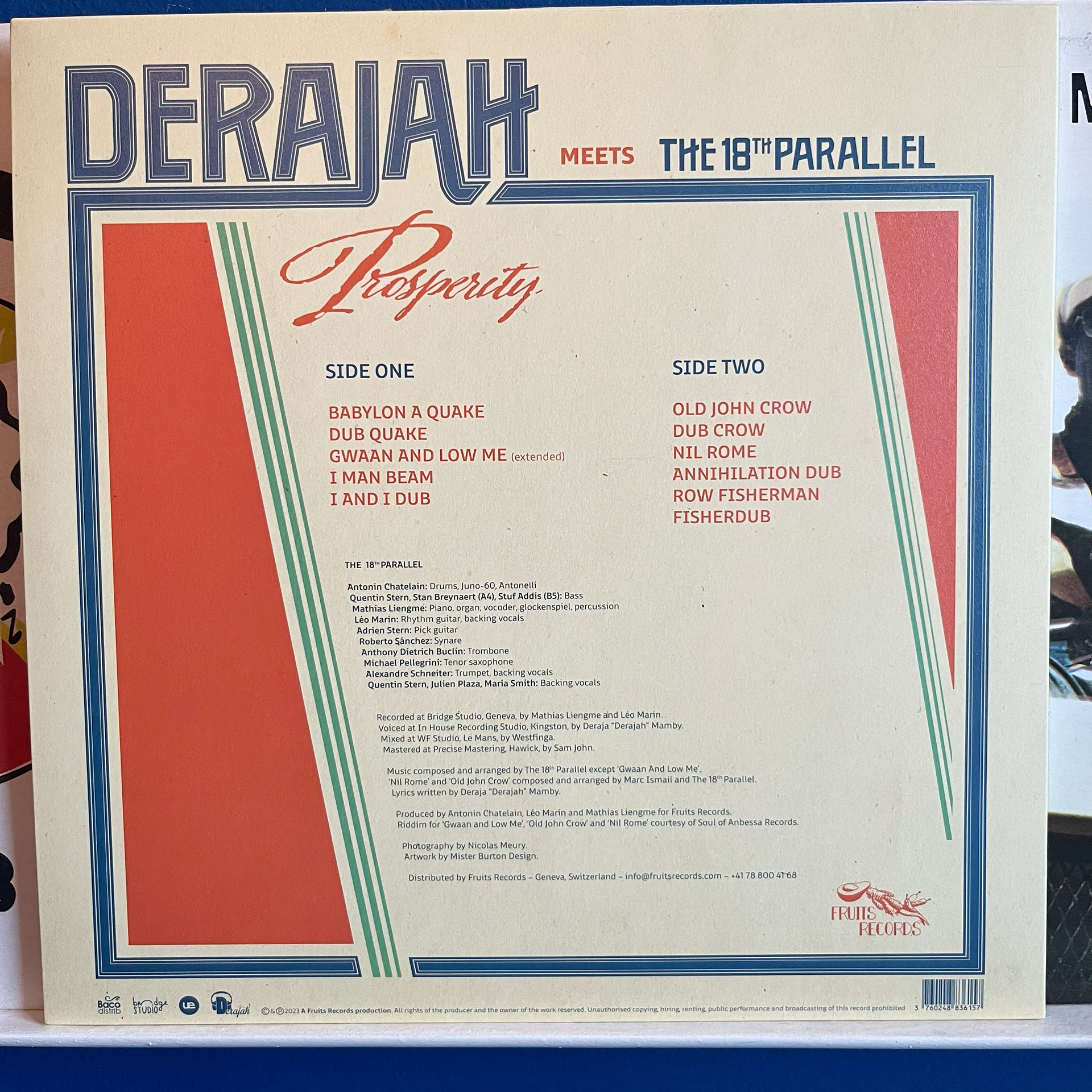
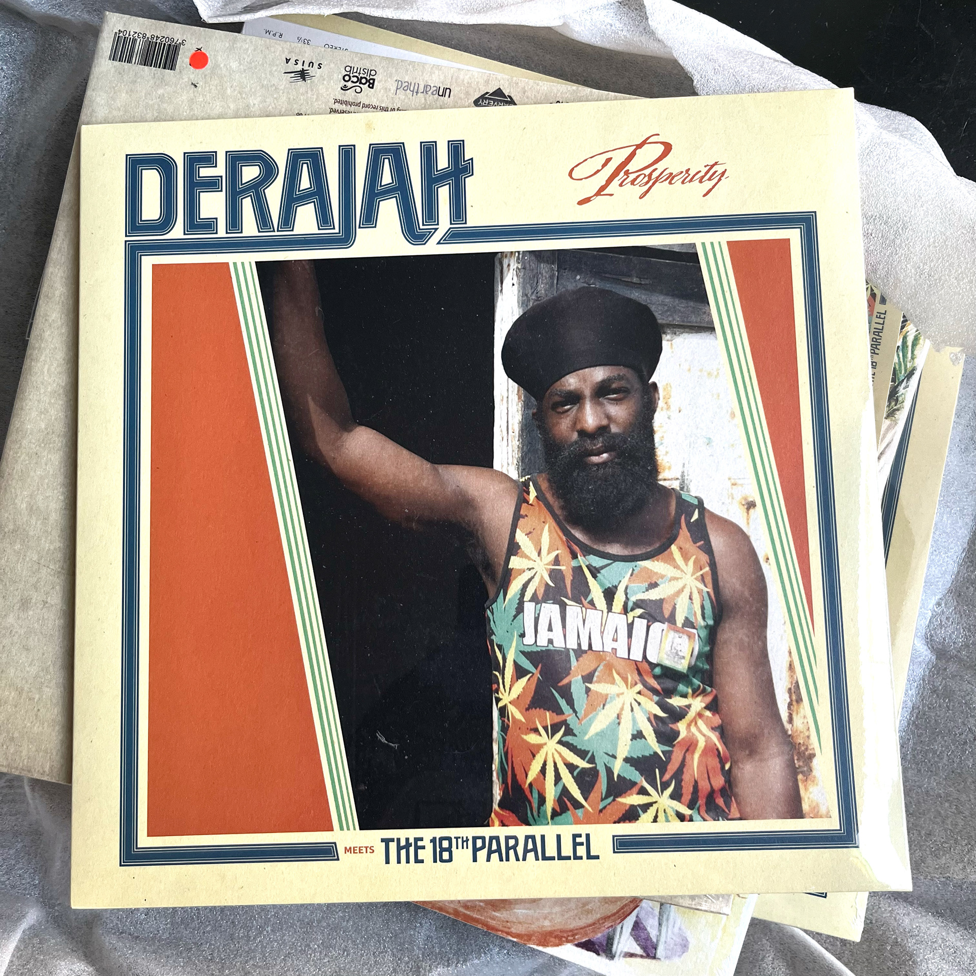
E9DFAFe Switzerland based reggae label Fruits Records asked me to design an LP and CD sleeve for their "Derajah meets The 18th Parallel" project. Their request came with a couple of wishes: the design must reflect the 80's style (rub a dub), a picture of the artist was to be the centerpiece, no use of existing fonts for the artist- and bandname.
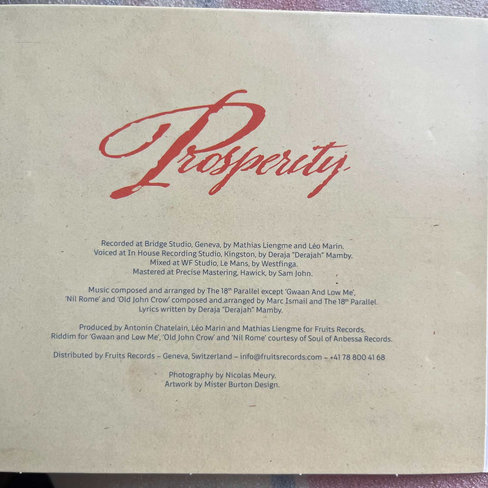
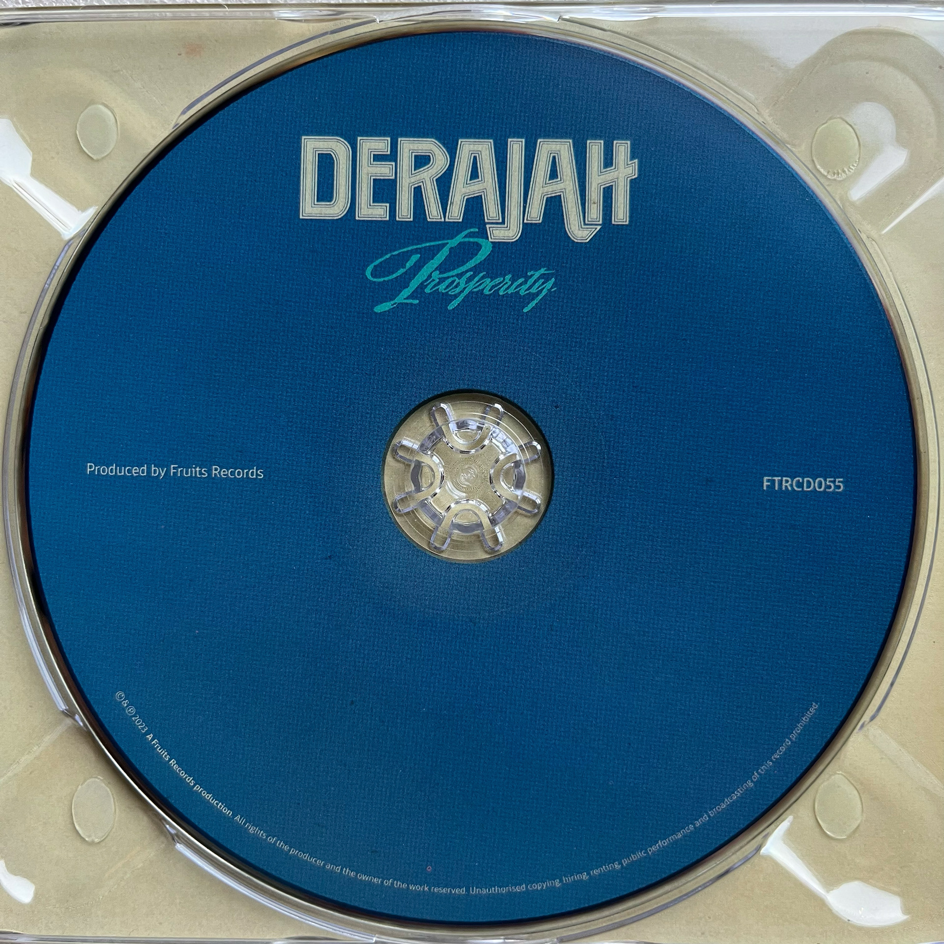
I started out with designing a font for the Derajah and The 18th Parallel part. Then included the picture and turned the title of the record (Prosperity) into a little tribute to my favorite Jamaican designer, Limonious. Here's the endresult.
Hope you like the work. Thanks for watching.
