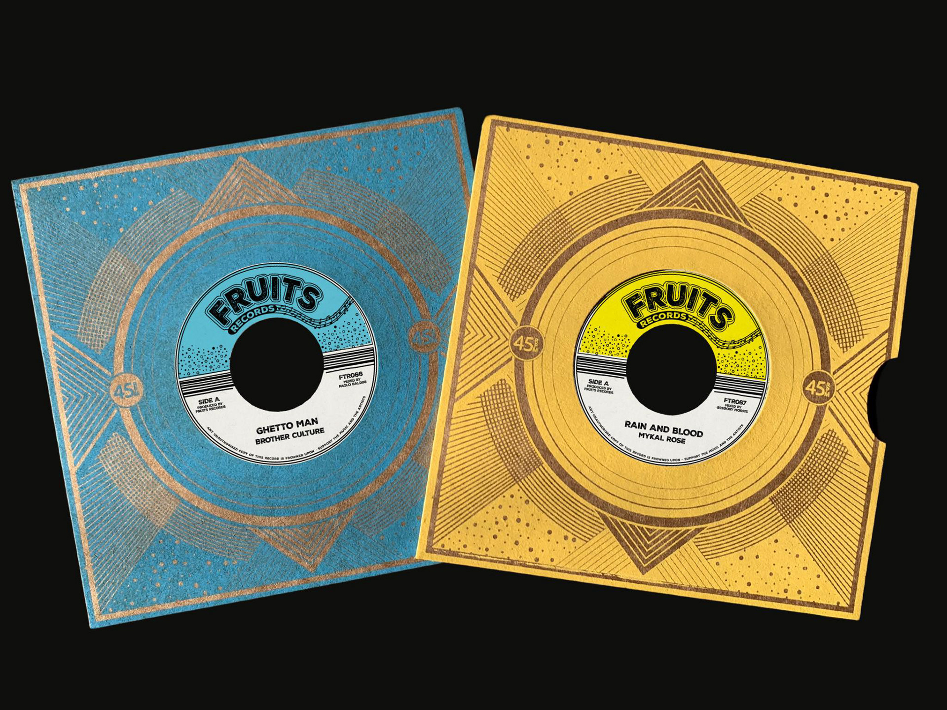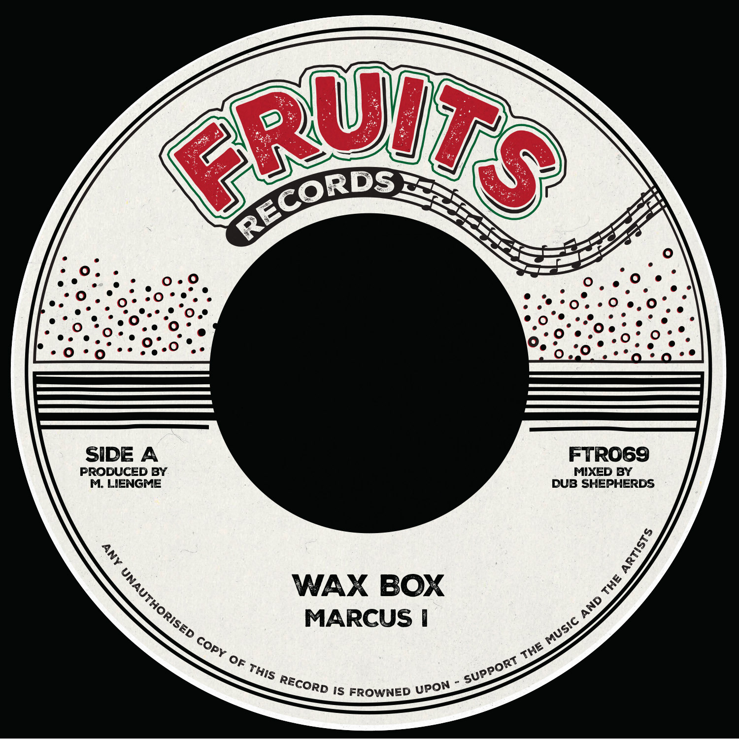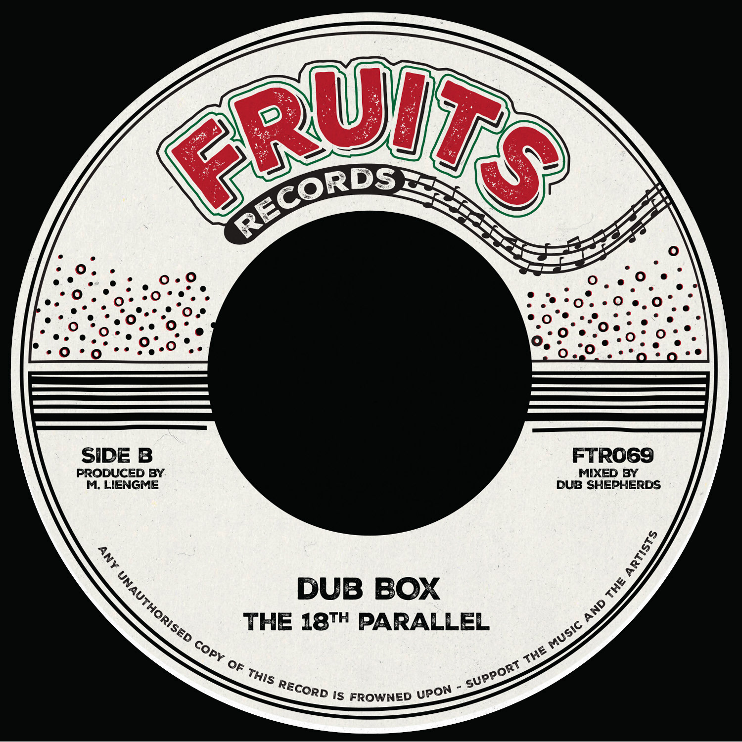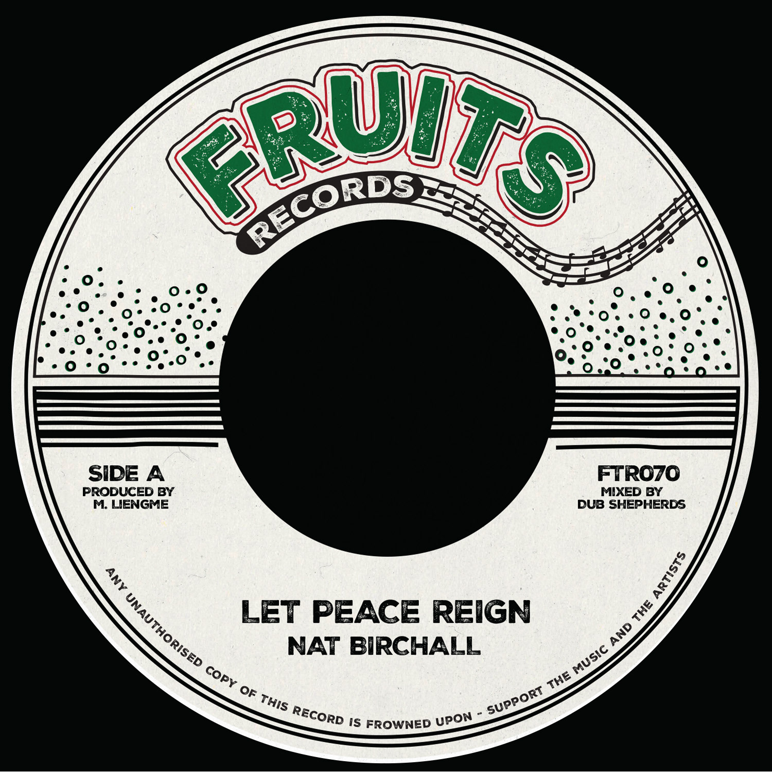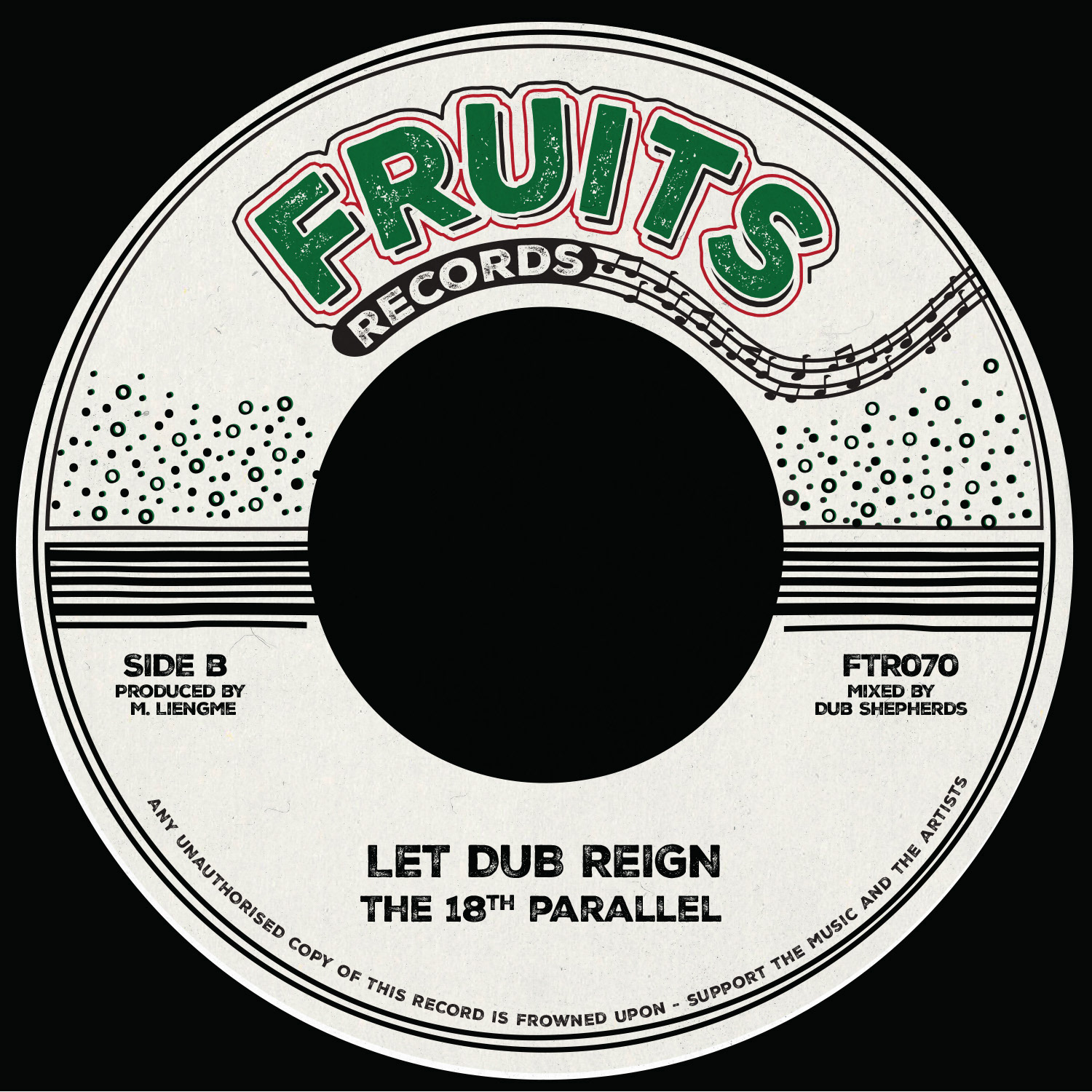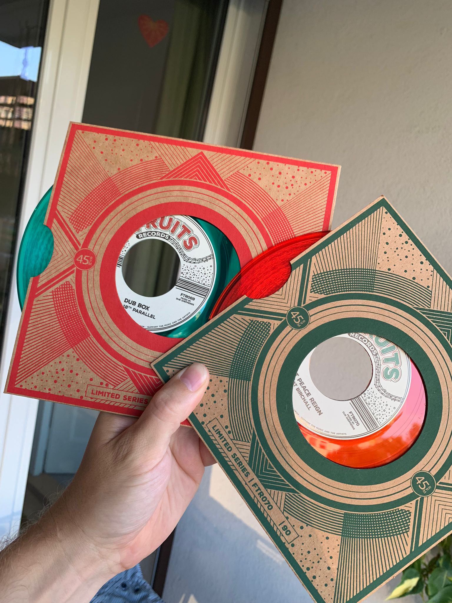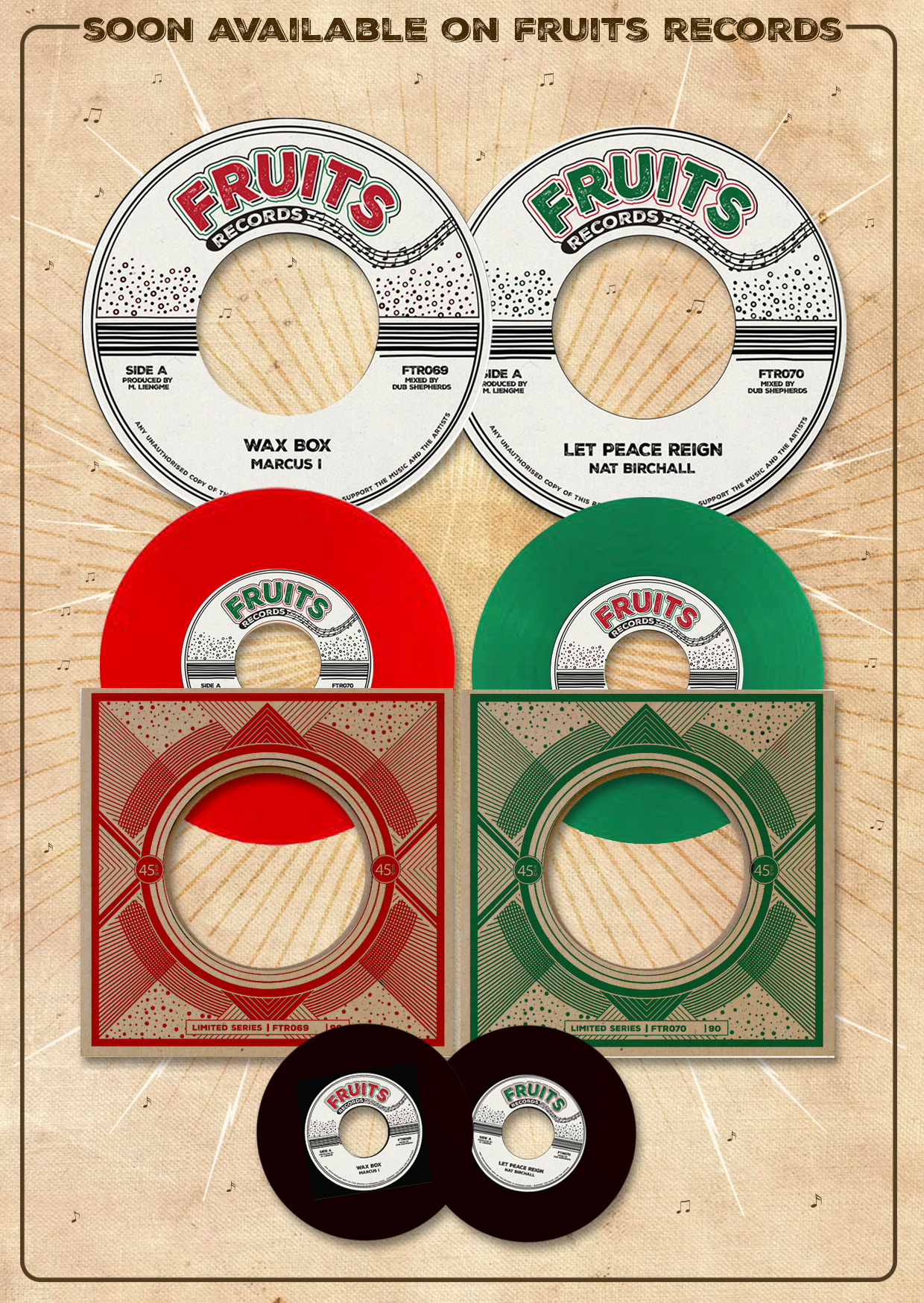
After receiving the first batch of singles for Fruits Records it was decided that the next releases would also be released with this design. I've tweaked the design itself a bit, mostly because the printer used smaller labels then we intended. So, I beefed it up to make the details stand out. It was then used for releases 66 and 67, using a top half colored design and a reversed design for screenprinted sleeve. Then it was used for releases 69 and 70, with the design focusing on two colors in the logo. Very mid seventies roots reggae style.
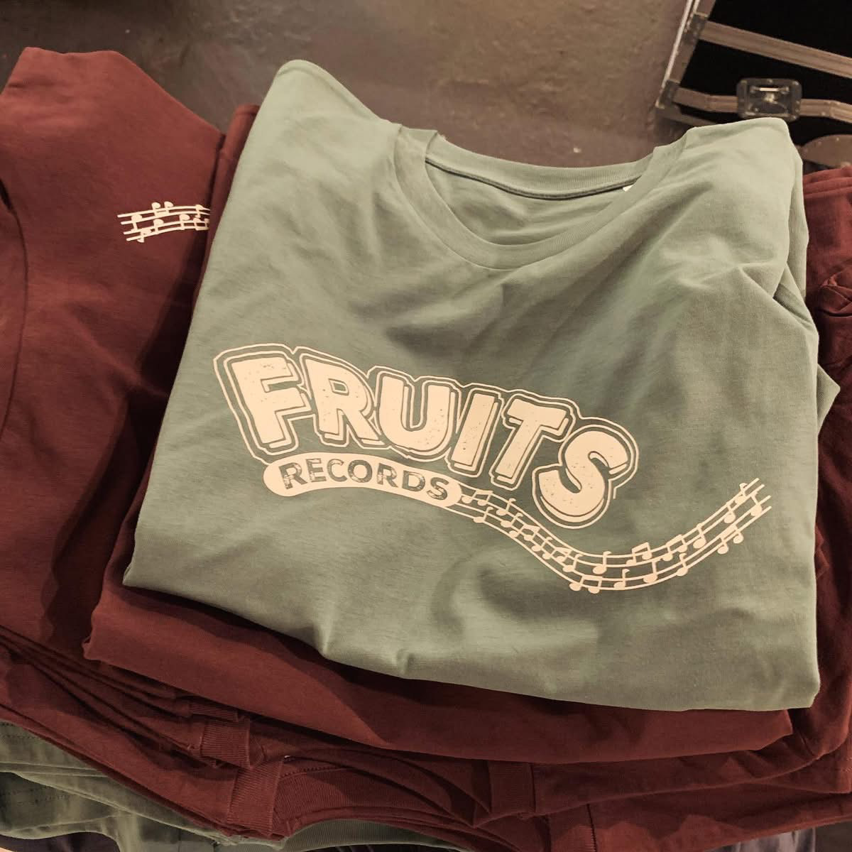
The logo was also screenprinted on a t-shirt, an idea I opted when I presented the first batch.
Onward and forward :)